User Experience & Interactions
2FA LOGIN JOURNEY
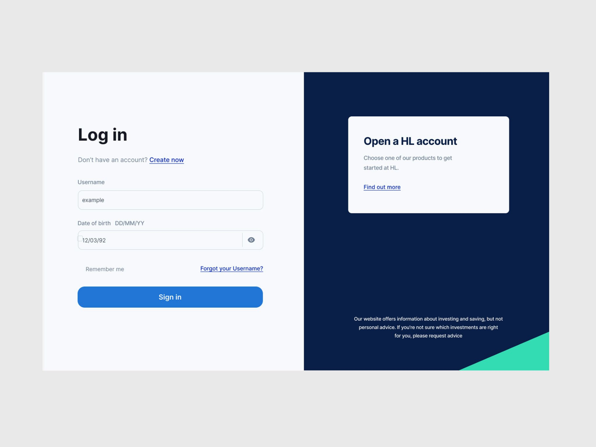
Leading the design process for the review of two-factor authentication (2FA) requirements and implementation. Our challenge was to enhance security by adhering to 2FA, while improving user experience and reducing friction during the login process.
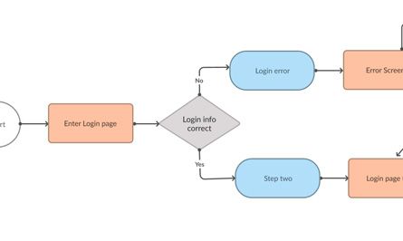
Working with the product team in the early discovery phase we found that the login process being used by the client, which included 'user name', 'date of birth', 'password' and 'secure number' checks already met two-factor authentication standards of the time, with a few minor changes.
We now had two possible approaches, keep existing journey with modifications or introduce a new journey. Whilst the product team tackled this question from a time and cost perspective, the designers focused on which out come would be most beneficial for the user.
Working with the clients research team we conducted user interviews and problem discovery interviews to understand how clients found the current process and any recurring problems that would need to be solved if the current process was kept. We also user tested a simplified version of the current process alongside a more traditional 2FA login journey. We had groups of clients and non-clients in these tests.

At the same time the project team planned the scope, time and cost of both potential solutions, scrap existing login process and implement new 2FA journey and system. or keep existing login journey making required modifications and improve experience.
After gathering and processing the initial insight the decision was taken to improve the existing process.
Having addressed the first challenge, I then led a 'journey mapping' workshop, the goal was to identify how the user experience could be optimised whilst making the 2FA required changes. The workshop was not only important for developing the product, but benefited the team by giving them an aligned goal and allowed us to play back, "What needed to be done", "What were the biggest opportunities", and "What success looked like", with senior team and project stakeholders.
This new shared vision helped the team understand the users which became the basis for our decision-making. Understanding the user needs became critical for informing the design and creating a clear plan for the minimal viable product.
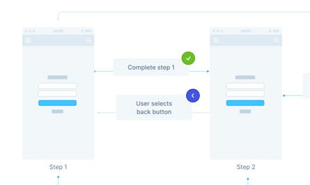
We then created a visual user flow to align on feature functionality before designing the interface, which allowed us to engage with and utilise the multiple tech teams that would be working across the project.
With all of the foundations, knowledge and preparation in place, we began to design the interface for the modified login journey, using the companies design system as a starting point. Which included 'individual login journey', 'organisation login journey', 'error states', 'self serve personal detail recovery', 'assisted personal detail recovery', and email. We completed further user test at key points throughout this process to further guide our design decisions.
As a result we saw an uplift in successful logins and a 53% drop in login related help desk call with minimal friction to clients.
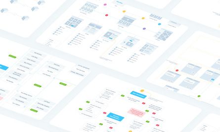

UI screen and component examples
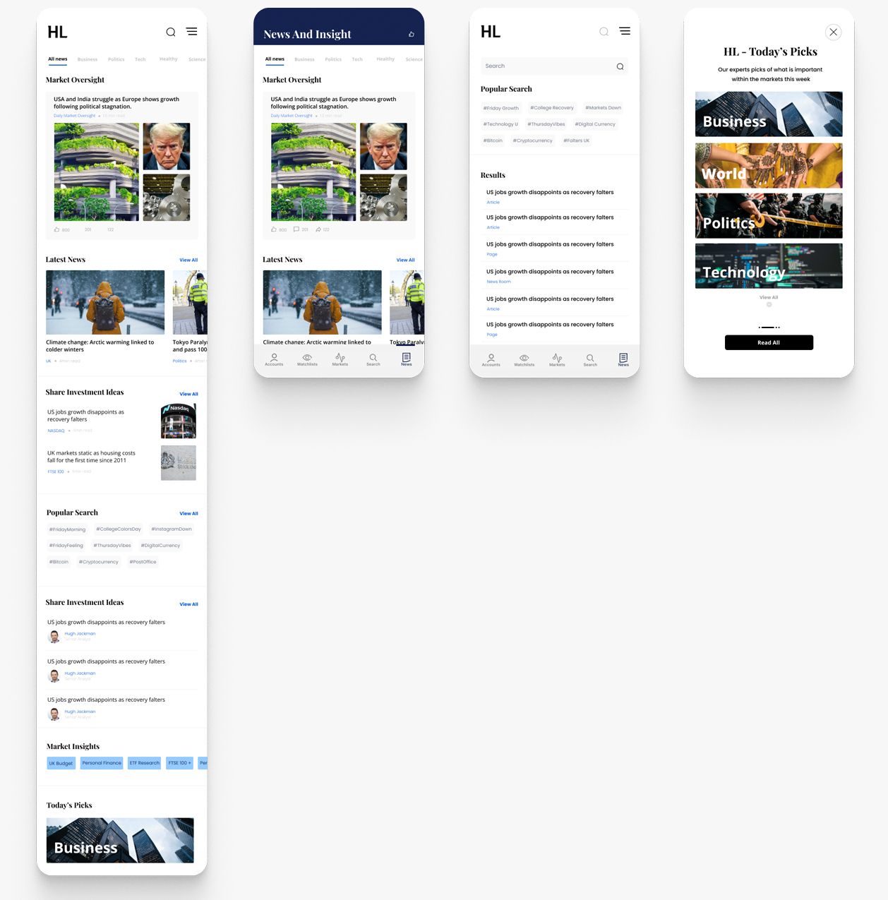
News section ideation, web and app
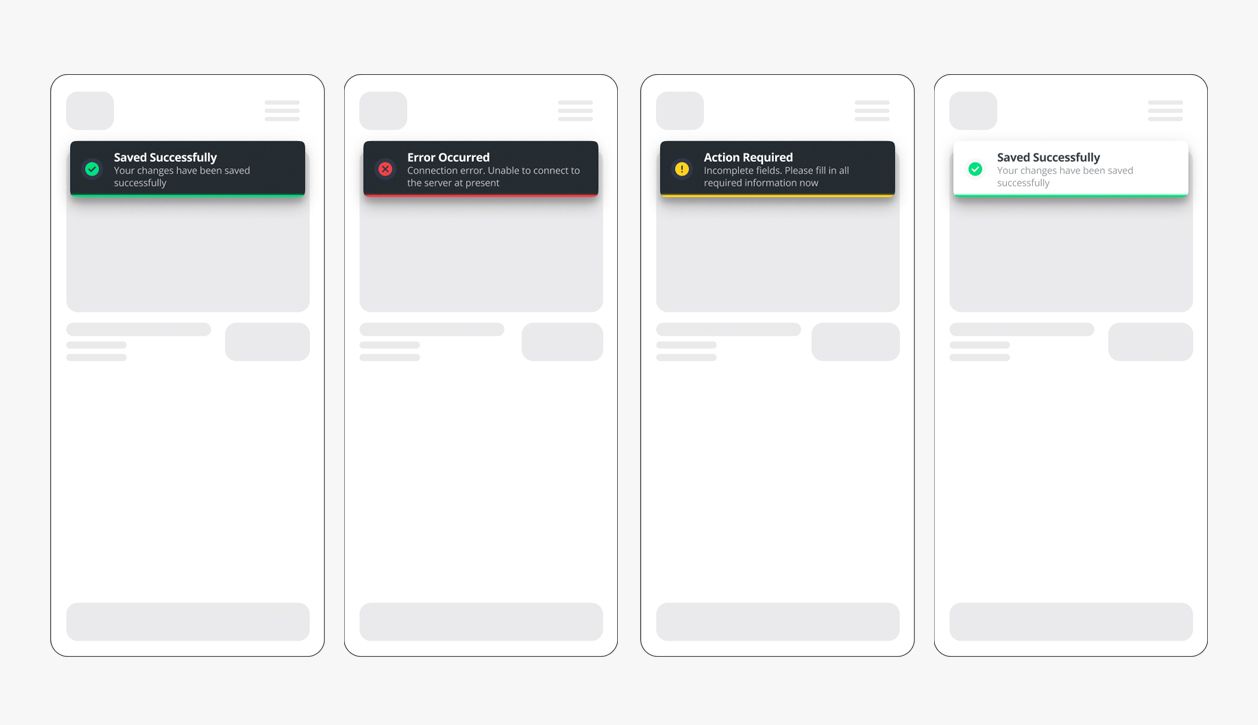
Ideation for HL app alerts/toasts